Showing posts with label printing. Show all posts

Monday, 10 August 2020

Oddball sheet from Israel

I'm always wary when I write about a novelty from another country's postal administration in case Royal Mail think it's a good idea and decide to do something similar.  Nonetheless I thought I would share this with you in case your interests range beyond just British stamps and you ever come across this.

A customer in Israel sent news of a novelty sheet of four stamps and 12 labels that was issued by the Israel Post Office in the spring of 2020.

My correspondent writes:
The nominal value of the stamp (16 shekels*) is the highest-valued stamp ever issued in Israel. The reasoning behind the choice of this value is unfathomable. It doesn't match any postal tariff and, if at all, will only be used in making up the postage on heavy parcels to the United States.  [* £3.53 - not a very high value in global terms.]


As explained on the information sheet supplied (click on them for larger images), the sheet
"contains four stamps on the bottom row and three rows of labels (which are not postage stamps), represents the products of each of the printing plates and the intermediate products obtained as each colour is added on top of the last. 
The top row shows the product of each plate separately inorder to demonstrate the process, but in reality only the black label exists first.  Each of the following rows shows the result after adding the second and third colours (cyan and magenta) and the row of stamps shows the result after the last colour (yellow) is added."


As a demonstration of the effects of the lithography printing process, this is interesting but nothing many of us haven't already seen with 'progressive proofs' being produced by Format International in the 1980s.  Although not expensive relative to the output of Royal Mail, Jersey, Guernsey, Gibraltar, Australia etc, it isn't exactly a necessary stamp issue.


Thursday, 24 January 2013

Two versions of London Underground booklet stamp

When I was first told about this difference I concluded that it was yet another case of poor registration on a Walsall printed booklet.

On most of the booklet we have the window frames in the tower are doubled due to mis-registration, and the thickness of the caption bar, BOSTON MANOR ART DECO STATION, on the booklet stamp is thinner than on the sheet stamp.

However, Dominic has now sent scans of two booklet stamps which show not only that the vertical height of that blue bar is variable (as might be expected from mis-registration), but that the spur up towards the date 1934 is also different.

(Click on the image for a larger one in a pop-up.)

Although there is some mis-registration on the left-hand stamp (see the shadow on the Queen's head and the ghostly grey colour of the face value), the thinness of the bar below 1934 is much thinner on the left-hand stamp than on the right.

And if you look at the blue caption below the stamp, this also seems to be shorter on the right-hand stamp, although that may be a trick of the scanner: I've asked for that to be checked.

UPDATE 25 January: My thanks to John G for this larger picture of the lower right corner.  This clearly shows that, while the amount of dark blue appearing in the spur is partly governed by the white space in the bluc background, the actual dimensions of the dark blue print are much greater in the right-hand stamp than in the left.  There are definitely at least two versions.  But why?  There should be one image dropped into every position on the cylinder.


Is it time for Walsall to give up printing these multi-coloured booklets?  One customer rejected multiple copies of the Queen's Diamond Jubilee booklet from other sources and asked if we had just one with the face value in white instead of with a cyan or magenta edge.  In fact we have several, but it did seem that the 'good' ones were not as common as the blurred ones.

Tuesday, 18 December 2012

Has Walsall produced the first British 3D-stamp?

A reader has sent this picture of the 2nd class 2012 Christmas stamp received today.  It's the sort of view that Santa might have after a few too many sherries on the night of 24th/25th December.

We're used to minor mis-registration of the colours on modern stamps produced on high-speed presses, especially on the booklets produced by Walsall, but this is a spectacular shift!

It's difficult to be sure from this image but it doesn't look like the De La Rue sheet version.

Thanks to AAB.

UPDATE: H J R has sent this image from the 1st class booklet, so it's not just Rudolph!


Saturday, 11 August 2012

Another gold medal stamp for tomorrow already assured!

A gold medal before most people have had breakfast - and we'll be showing that later.

Meanwhile, there's an interesting article about the production operation and the process for ensuring that the stamps reached Post Offices on the following day, even when the medal wasn't won until 10.30 pm in Print Week.


Ed McKeever powered to victory in the men's 200m kayak to win Britain's 26th gold of the Olympics.The 28-year-old dominated the K1 single final, with Spaniard Saul Craviotto Rivero taking silver and Canada's Mark de Jonge bronze.


And one edit is followed immediately by another as Mo Farah wins the 5,000 metres!

Monday, 6 December 2010

Odd flaw on 97p Christmas Wallace & Gromit

I've been sent this picture of an odd flaw - which appears to be properly screened - at the foot of a 97p Christmas stamp:


The flaw is not composed of any single colour from the CMYK group, and seems to be partly a mix of yellow and black, and partly of cyan and black.  It could be a 'foreign body' in the print - it isn't a 'foreign body' on the stamp itself.

Has anybody seen anything similar on this set or others, or any explanation of this flaw.  Let us know by using the Comment faclity!


Wednesday, 21 July 2010

I wonder where the yellow went - Wales 1st class oddity.

Why are cylinder numbers and plate numbers printed on sheets of stamps? Partly it's to record which plates have been used, and partly to show which colours have been used. Although there are other methods - like colour dots/traffic lights - the cylinder number also shows that the colours are all present and properly aligned.

So here's a little mystery which goes back to 2006.


On the left, the original version with colours as listed in the catalogue: blue-green, greenish-yellow, silver & black.

On the right, the 2006 version with the yellow replaced by black - but the stamp looks the same. Indeed, the stamp IS the same, I'm sure yellow is still present (* no it isn't!). Below, the date and colour-check marks in the right margin, also with the yellow replaced by black.


So what's the point? If the yellow wasn't clear enough to see when the sheets were checked, how does replacing the yellow cylinder number with a black one - which must have been printed with the black cylinder - help anyone??    * Official response here.

Thursday, 21 January 2010

So what do the sheet grid marks really mean?

Although many collectors may not know it, special stamps are still available from 'guttered' sheets. That is, printed sheets have (at least) two panes which are divided along the gutter for distribution to counters.

In recent years Royal Mail has copied the US practice of having a grid in the margin, divided into 4 or 6 squares, one of which has a dot in it, indicating the position of the pane in the overall sheet.

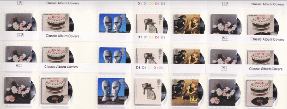
This is how some dealers are able to sell gutter pairs, although when the gutter is vertical between two different sets of 5 stamps, that makes for a long gutter strip! This is a view of part of three double-sheets:


It isn't easy to see in this but the grid positions are:

Upper sheet: position 2 - position 3
Middle sheet: position 3 - position 1
Lower sheet: position 1 - position 2

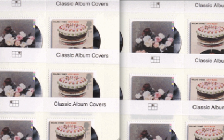
You can see it more clearly here:


Now, if the panes are printed in three positions horizontally, one would expect that one pane (say position 1) would be guillotined off for counter sheets, leaving the other two for philatelic distribution. As the print run would produce more double-panes than would be necessary for philatelic distribution, a large number of the pairs of panes 2+pane 3 would also be guillotined for distribution to post offices.

So why have we got all three possible combinations? We have -

Pane 1 + pane 2 (lowest)
Pane 2 + pane 3 (uppermost in this picture), and
Pane 3 + pane 1 (centre).

Is the cylinder circumference in fact 6 panes round, with positions 1, 2 & 3 duplicated?
Does the grid mean anything at all?
Should we revisit previous grid markings - including for definitive and country stamps - to review what they mean?

Please leave your suggestions as comments!


In the absence of comments I'll suggest a fourth possibility - in fact more like a probability:
There are three panes to a cylinder with a gutter between each, but they are cut into sheets of 2 panes - 1+2, 3+1, 2+3, 1+2 ... etc.