This is true again with the Queen Victoria Bicentenary prestige stamp book definitive pane. This is the publicity picture which we showed earlier.
The 2p is quite unlike the one included in the RAF PSB (on the left) in 2018. This must surely have a separate listing in the catalogue.
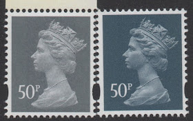
The 50p included in the Harry Potter PSB is a different shade to the current (gravure printed) counter sheet, so this is comparison with the 2017 counter sheet (SG U2925 on the left), which likewise ought to be considered a different stamp even if it were not for the year code.:
And this is the comparison with the Battle of Waterloo PSB (SG U3077)
The 1st class reproductions of Victorian stamps may not be regarded as sufficiently different, although the 2d blue especially is considerably darker - what do you think? The phosphor is also different if viewed in the 'hold to light' way.
1d black SG3807, 1d red SG3808, 2d blue SG3809 - top row from Royal Mail 500 PSB (2016), lower row from latest book.
At least they didn't change the corner letters (hope they aren't reading this!).


One would think that in this day and age with all the modern technology specially within the printing industry the printers would be able to match colours that at least look similar to one another. All of the prestige books are printed by the same printer so why can the colours not be matched up together?
ReplyDeleteIf the blog of the 29th April 2019 is anything to go by we are bound to have a lot more new numbers with all these colour variations that is with or without the 'P' in source coding.
This comment has been removed by the author.
DeleteCouldn't agree more, Brian. If this were the second decade of the 20th century, or even between the wars it would be normal for each printing to have the possibility of being different.
DeleteBut we are now seeing a greater level of variation than we saw in the pre-decimal Machins, and many of the later ones managed a far greater degree of consistency across different printers, than we see now from one
The cynic in me wonders if creating seemingly infinite (unheralded) variation is just another ploy by Royal Mail to sell ever more stamps which will never be redeemed (i.e. used to pay for for postage).
ReplyDelete