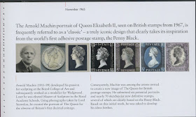
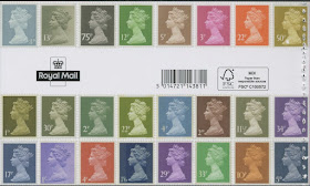
Although most serious collectors of Machin definitive stamps will be aware of much of the background to the design, and the work that went on before the first stamps were issued in 1967, and the many developments that have taken place since then, the Prestige Stamp Book usefully brings all this together. The book has 12 non-stamp pages of text written by Richard West MBE, former editor of Stamp Magazine.
Page 1 shows Arnold Machin (the portrait used for the 2007 1st class stamps in the miniature sheet and smilers sheet), with sketches which included four different portraits.
Page 2 shows further designs based on photographs of the coinage head mould.
Page 3 introduces the new photograph by John Hedgecoe, from which followed a new plaster cast, giving rise to further essays.
Pages 4 and 5 show how the design was developed through to the final design
Subsequent pages show actual stamps as issued from June 1967, including the 7d and 8d with the value 'behind' the head - which looks really odd after 50 years! (Pages 6 and 7)
Decimalisation brought a new typeface for the figures of value and mostly new colours although the 5p and 9p retained their pre-decimal (1s and 1s9d) colours. (page 8)
Page 9 takes us through to the new larger photogravure high values, the first stamps printed outside the UK, and in lithography by Waddingtons and Questa.
Page 10 brings NVI, 1990 double-head, elliptical perforations and self-adhesive stamps.
The small recess-printed high values, Millenium 1st class, Airmail and PIP stamps are shown on page 11, while page 12 brings us up to date via the £1 ruby introduced for the 40th anniversary, the security stamps of 2006, Recorded Delivery stamps, the 1st class stamps for the Queen's Diamond Jubilee and Longest Reign, and the change to Royal Mail Red. It is good to note that the gold security stamp has no year or source code. The Diamond Jubilee and LTROU stamps are copies of the actual stamps unlike so many of the illustrations used by Royal Mail elsewhere. These two have no security slits indicating that they were taken from the miniature sheets: the codes are not visible.
The inside back cover includes all the technical information including that the stamp panes are printed in gravure except for the pane of 4 x £1 gold foil stamps, "printed in lithography and foiled in gold" by International Security Printers. The outer covers show a selection of decimal and pre-decimal issued stamps in their original colours.


Thanks Ian
ReplyDeleteI just spent 10 minutes reading this piece (and the panes). A nice prestige booklet with lots to display when broken down. Can you post a pic of the Pane with 4 x gold foil £1 values in Litho?
Royal Mail should take a note out of your book on how to display stamps on their website, it would certainly increase sales. Even their large images are quite small and you can't even tell what stamps are real on their picture of the golden anniversary celebration stamp sheet.
ReplyDeleteInteresting to see double stitching on part of the leaves
ReplyDeleteAnother book in the pack was only half-stitched - would have been easier to separate!
DeleteOne thing have only just noticed about the decimal values in the Perpetua font: they use a capital I instead of a figure 1, without exception! Before the values were "slimmed down", they also used a capital O instead of a figure 0 (e.g. the initial 10p (or IOp!) stamp.
ReplyDeleteIncidentally, does anyone know the rationale behind having two of the predecimal stamps with the value at the right? It seems bizarrely inconsistent for such a sleek and minimalist design.
Another
Douglas Muir's book, "A Timeless Classic" discusses the placement of the value. Machin actually preferred having the Queen's head centered on the stamp and the value at lower right. However, the Queen was shown both and preferred the value at lower left, with the head shifted slightly to the right. This would also leave more room for denominations of one shilling and above. However, PMG Short, who also preferred the value on the left, requested approval of a mix of positions to help his staff differentiate the values. The Queen's representative said it would be okay to have one or two denominations with the value on the right.
DeleteAs for why this was discontinued, my guess is that it was determined that the consistency of all values on the left was desirable, and so that was done when the decimal versions were issued in 1971.
Got my issue today, I think that Royal Mail could have made a better job of it really, the Gold £1 is horrendous looks like a money off coupon , the perfect opportunity to give us collectors lots of new Machins missed. :-(
ReplyDeleteSome people would think that four or five - or 20+ for the specialist - would be quite enough. See http://blog.norphil.co.uk/2017/05/machin-anniversary-50th-anniversary.html
DeleteI really don't understand your 'money-off coupon' comment, and I'm sure the customers getting them on these packages will be pleased
https://twitter.com/ian_norvic/status/871698891690954752
Well, I agree that the Machin miniature sheet and the prestige book are both winners and that they have probably found a good balance of "new" stamps.
DeleteHowever my one reservation about this otherwise excellent issue is that £1 stamp. I feel that it is quite possibly the ugliest Machin ever issued. Certainly the only only rivals to come anywhere remotely close to winnning that unwanted award are the letterpress black 1st class Machin and the "invisible" white embossed 1st class Machin. (Both from the "Profile on Print" prestige book.)
I would have to agree about the £1 stamp. It does look a bit gimmicky to me, but that's a personal preference. I think it would have looked better printed in the 1st gold colour instead.
DeleteApart from That, a great selection of machins to add to my collection. Can anyone say who printed them? I have seen them listed on a specialised dealers website as being Cartor in gravure. I thought it was the Walsall arm of ISP that printed in gravure and Cartor printed in litho, or am I mistaken?
Cheers, Steve.
This comment has been removed by the author.
DeleteI can only say that what is printed on the inside back cover (above) agrees with what we were told by Royal Mail - as we would hope.
DeleteI understand that both Walsall and Cartor arms of ISP have both litho and gravure capacity, even though we have so far been told that Walsall work is gravure and Cartor litho.
Interesting Ian, I didn't know that (your 2nd paragraph). I've deleted my previous comment as I meant to say that the Machin panes definitely look gravure to me.
DeleteThe iradescent overprint appearance on the 1st and £1.00 Ruby suggests to me they were printed by Walsall. OK, it's not exactly scientific, but it looks the same as other gummed Walsall printings. That's how I'll be writing them up anyway.
DeleteIan, thank you for the reply. I wasn't aware that Walsall and Cartor both had litho and gravure capability.
ReplyDeleteTrelantis, I looked at the PSB panes under a hand held microscope and they are printed in gravure. The phosphor bands look like they may have been applied using lithography.